Typographic campaign concept and visual language for an AI-powered scientific research platform
The challenge
Causaly operates at the intersection of AI and biomedical research, helping scientists and specialists navigate complex data to accelerate discovery. The marketing challenge was significant: the category was dominated by generic tech aesthetics, abstract data visualisations and illustration-heavy approaches that all looked the same. Causaly needed to stand out as genuinely intelligent and credible without resorting to the visual clichés of B2B technology marketing. The audience were highly knowledgeable specialists who would see through anything superficial immediately.
My role
Design Director / Creative Lead
Worked closely with the creative team to shape the campaign concept and visual language
Led the development of the typographic led approach to express clarity and authority
Ensured alignment between creative execution, strategic intent and stakeholder expectations
Focused on visual judgement, concept development and design direction rather than volume delivery
Led the development of the typographic led approach to express clarity and authority
Ensured alignment between creative execution, strategic intent and stakeholder expectations
Focused on visual judgement, concept development and design direction rather than volume delivery

The Work
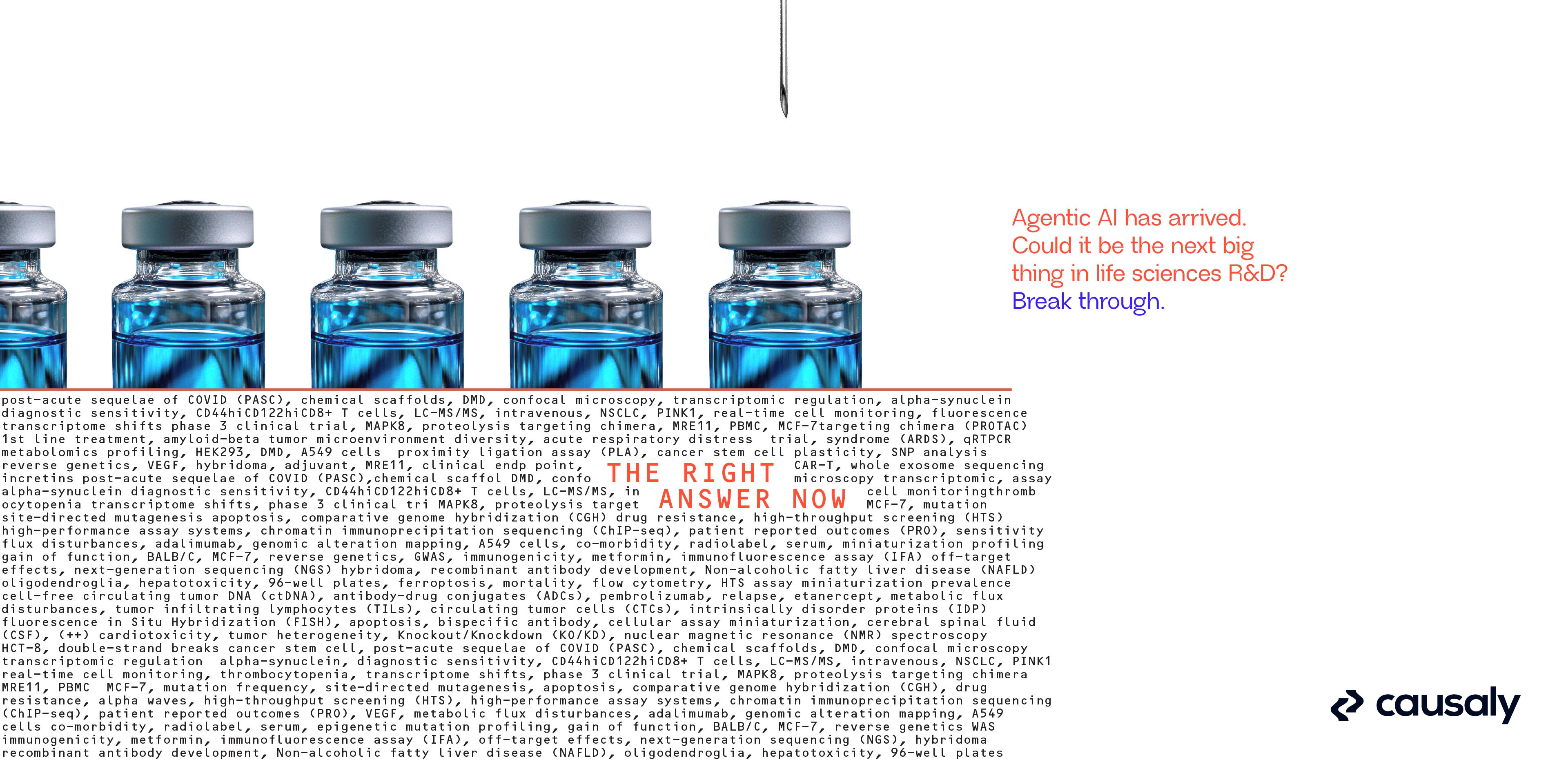
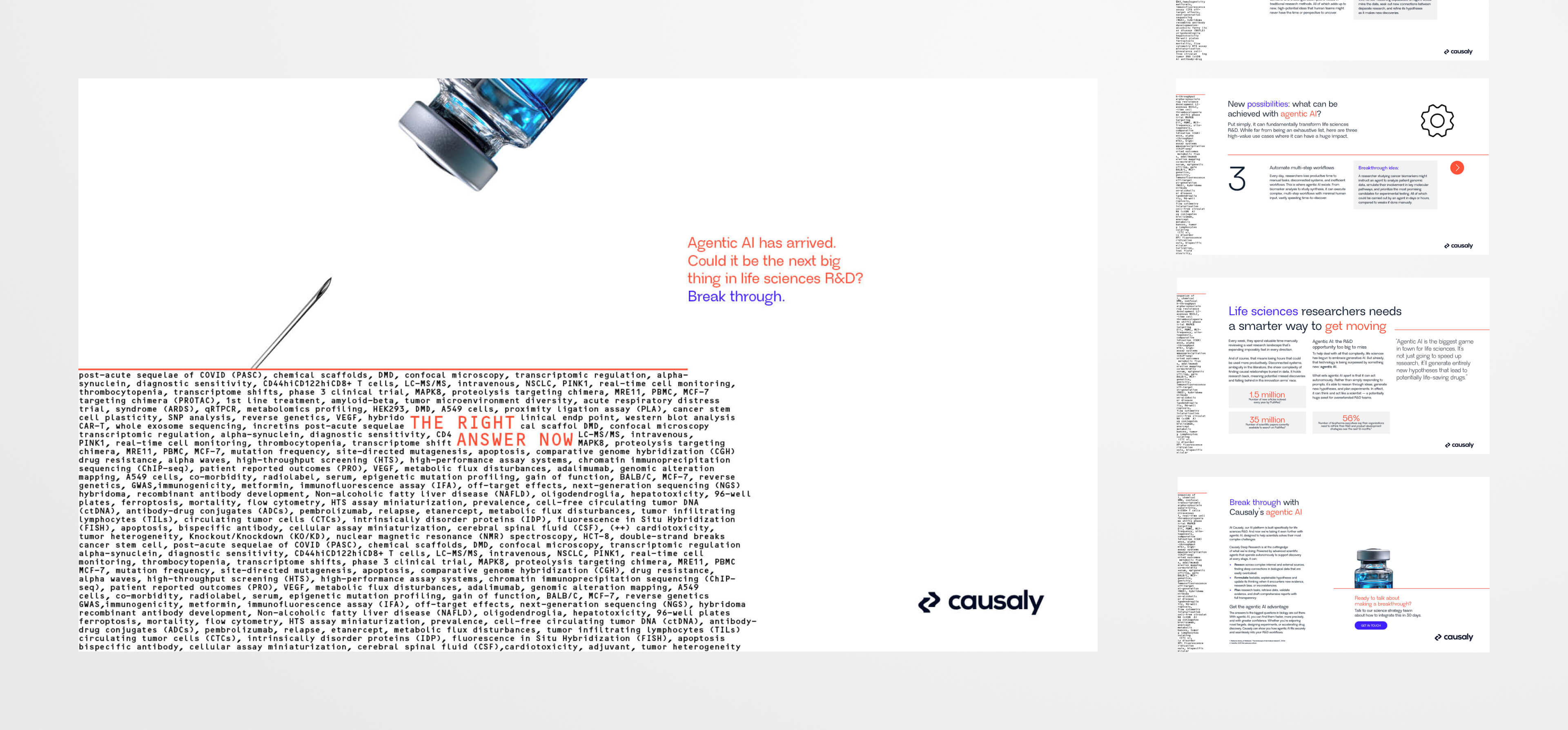
The campaign was built around a bold typographic led visual system, using language and hierarchy as the primary creative device. Rather than illustration or product led visuals, the approach used scientific terminology itself as raw material, making the complexity of the subject matter part of the visual idea. Large scale type, precise hierarchy and restrained editorial layouts communicated rigour and intelligence while remaining accessible and distinctive.
The visual system was designed with four clear principles in mind: to reflect scientific precision, to communicate confidence and intelligence, to cut through visually in a crowded B2B technology space, and to allow complex ideas to be expressed with clarity and succinctly.
The result was a considered, editorial style visual language that supported Causaly's positioning as a serious AI-driven research platform, built to extend flexibly across paid social, content, web and email touchpoints.


OUTCOME
Delivered a campaign visual language that felt genuinely distinct in a category where most brands look identical. The typographic approach gave Causaly an ownable aesthetic that communicated intelligence without relying on abstract tech imagery or generic illustration, helping the brand present itself credibly to a highly sceptical specialist audience.
The system's flexibility was a key deliverable in itself. Built to extend across multiple formats and touchpoints, it gave Causaly's marketing team a clear creative framework to work from independently, rather than a one-off campaign execution that couldn't be sustained.